|
|

|
|

| A simpler, more dynamic brand! |

1) THE SHAPE - The easy and quick-to-recognise symbol, is a restyling of the S of SMI. The shape is dynamic and generates a circular movement, symbol of the energy which expands outwards from the inside. The rotation movement recalls on one side the concept of the rotary technology of the Smiform stretch blow-molders, while the enveloping movement of the two curves which meet to form the S bring to mind the concept of packaging and so of protection.
2) THE COLOUR -The brand is personalised by an orange tip: a colour synonymous with freshness and innovation for its ability to reawaken the mind. Smigroup has wished to maintain this colour, which was already present in the previous logo.
3) THE CHARACTER - The round shapes recover that of the preceding lettering, but the simpler and more compact style improves its legibility. Smigroup, though belonging to the engineering sector has chosen to maintain round shapes (synonymous with flexibility and dynamism), which tend to lighten a brand which, traditionally, the sector would want with more squared shapes.
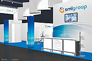
The appointment to discover Smigroup's new look is at Drinktec 2009, STAND 302 - Hall A6.

| Marketing Department info@smigroup.it |