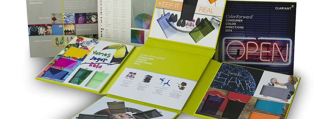
- The 8th Annual Color Direction Guide for the Plastics Industry.
- Predictions based on intensive research of the most influential societal trends around the world
- Gives product manufacturers a head-start on potentia consumer-purchasing decision drivers
Clariant, a world leader in specialty chemicals, has published its ColorForwardTM color and trend forecasting guide for 2014. Designed specifically for the plastics industry by Clariant’s ColorWorksTM, ColorForward uses the language of color to express the trends that will attract people's attention and pave the hue palette for 2014.
Fresh palettes inspire designers and brand managers with marketing insight for 2014
Color delights the eye. Color differentiates. Color adds value. Color identifies form and function. As a tool that communicates emotions and stories, color has the power to transcend and translate cultural, political, religious and social influences for the greater good. For years, ColorForward’s predictions have helped define the colors that will attract and move consumers in the future. The service has helped manufacturers of all types of products immensely by giving them a head start on using the power of color to intercept consumer-purchasing decisions. Now in its 8th year, designers and marketers of plastics products hail the newly launched ColorForward 2014.
ColorForward’s color predictions are based on intensive research of the most influential societal trends around the world, researched by the members of the ColorWorks global network, by tuning antennas to the huge array of events, exhibitions, and conferences, as well as to trends emerging in the planetary village, and by distilling them to a set of truly global influences. Experts from the world’s major trend-watching organizations, and color experts from industries as diverse as architecture, textiles, housewares, automotive, and fashion are actively contributing to the process by sharing their views and thoughts.
Uncovering the most significant trends and the colors they engender is not a simple task. For ColorForward 2014, color, design, marketing and polymer experts from every part of the world, representing multiple disciplines, came together this year to participate with the aim of not only identifying societal trends that are uniquely global, but also developing harmonious colors that reflect each trend’s unique influence.
2014’s color palette is based on four outstanding societal trends expected to have a key impact in the near future:
Keep It Real
At a time when consumers are overwhelmed with brands and bored with me-too products, how we can keep them excited is the key question every manufacturer is asking. People are seeking to feel a connection with the products they buy. They want to buy brands that are real, transparent and tangible – and to succeed in wooing them, manufacturers need to break this code. To stand out in the marketplace, brands have to be all about service and connecting with consumers on a more personal level.
Customers can evaluate the worth of the products and services at levels not possible before. Norzihan Aziz, Head of ColorWorks Asia Pacific Region further details, “The color palette plays off of this new form of power. One of the colors, Genuine, represents transparency and honesty. It’s grounded and a mindful color, reminiscent of the authentic feel/taste of an olive. It is a classic color that will withstand the test of time”.
Re|use|full
Having survived the current recession, the public is tired and disappointed with old ideas and waste. They are now enthused about repurposing the old into new. This theme refers to a new freedom of expression, in making new and purposeful accomplishments, simply through the process of looking at existing materials from different angles and producing new creations.
“The colors are a visualization of thinking outside of the box, of morphing discarded products into new-generation identities,” explains Simon Clarke, Packaging, Market Segment Manager, Asia Pacific, “The colors are blended with robust feelings of timelessness, creating a renewed impression of longevity and permanence.” Let’s re-use and re-combine old thoughts to recreate something that is completely conceptual and fantastical. This is the new mantra that inspires everyone.
There to Share
We are living in the age of digital information and mobile devices where information is accessible to everyone. Shared Thinking is a new approach to inquiry-based learning, collaborative reflection and networked learning. Our current generation is more open to sharing than hoarding knowledge. Uniting ideas to collaborate and solve world problems is in. Money, possessions or degrees are perceived as less important, while the sharing of knowledge is seen as generous, and of true goodness and value.
One time zone, one of the colors in this theme, gets its deep, dark color inspiration from the city late at night. “The blackness recalls a city by night; the red sparkles represent individual persons all over the world, digitally interconnected, sharing their experiences, thoughts, and ideas. At the same time, this color represents the moment at night where one easily connects across time zones, as technology allows us to share effortlessly and in a fast manner,” reveals Judith van Vliet, designer at ColorWorks Europe/IMEA and a member of the ColorForward team.
Vamos Jogar Bola
The true spirit of Brazil is what defines this theme. The international football tournament will unify diverse countries and draw together millions of fans over one shared passion – their love for football, which really can reach religious fervor. Brazilians also express their joy through their colorful carnival infused with heart-pounding samba music and dance.
These joyful events draw large crowds and, by extension, also can be perceived as an invitation to come together and unite to solve global problems. The world is growing rapidly, and as it opens up, new markets emerge – especially the ones inhabited by the rising lower middle class. Brazil is investing huge amounts of resources to change the country. The phenomenon of inclusion can be seen everywhere in the country. In addition, sustainable development events are powered by innovation. There is so much joy in the air, as Brazil has so much to celebrate.
Tapirapé Splash Green, one of the colors in this category, gets its inspiration from the lush green Amazonian forests of Brazil. “The color is very predominant in the country’s flag, natural surroundings, and of course, the soccer grass. Green is one of the most present colors in Latin America’s culture, and society. The Tapirapé are one of Brazil’s indigenous tribes that survived the European conquest and subsequent colonization of the country, keeping with little changes most of their culture and customs. Their tribalism and the relationship of man and nature are what have added to our color inspiration,” says Antonio A.F. Rollo, Regional Key Account Manager for Latin America.
These four trends have been chosen by Clariant’s color experts from a myriad of other global inspirations as they have been found to inspire the unique color palette for 2014.
To learn more about ColorForward, please visit www.colorworks.clariant.com and click on the Color Trends tab. Clariant also offers seminars at the seven ColorWorks locations as well as at selected conferences and at customer sites.
Clariant Masterbatches products are marketed under the following global brand names: REMAFIN® olefinic masterbatches and compounds; RENOL® masterbatches and compounds based on engineering resins, styrenics and PVC; MEVOPUR® masterbatches for medical and pharma; CESA® additive masterbatches; HYDROCEROL® chemical foaming and nucleating agents; OMNICOLOR® universal color masterbatches, and ENIGMA® special effects. These brand names are all registered trademarks, and ColorWorksTM and ColorForwardTM are trademarks of Clariant.


