Clearly Distinct from Greenwashing
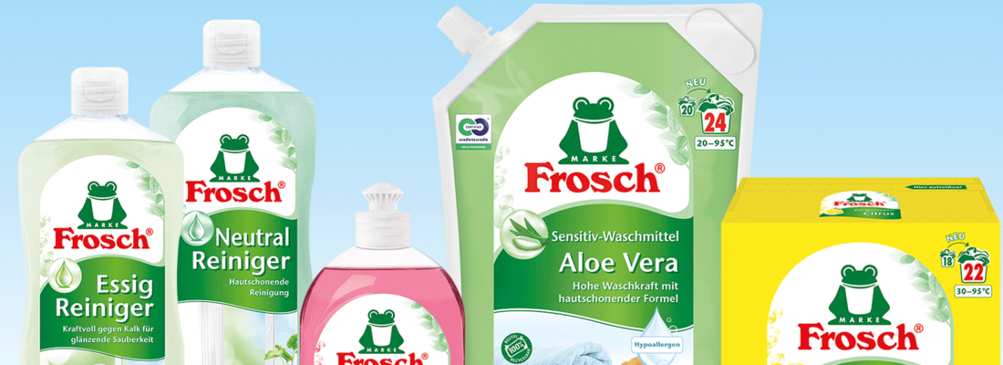
The need for a design relaunch grew from that long history. When the brand was launched in 1986, the design chosen was intentionally minimal, without extraneous details and with just a few colors. A major remake of the packaging took place in 2001 when the complete assortment was converted to PET bottles with a clear and brilliant design meant to highlight the natural ingredients. In 2022, the Frosch brand sports a new look that shows consumers at a glance its uniqueness as a sustainability pioneer.
"Wherever credible environmental advantages can be connected to the joy of being alive and hedonist pleasures, we get closer to our goal of making sustainable brands attainable for the majority. That's why it is important at this moment to present our trusted Frosch brand—with our graphics too—as a fresh, fun-loving and thoroughly modern product range," says Werner & Mertz owner Reinhard Schneider.
Global, Uniform Design
The new design incorporates the brand's eco-credentials. They underscore the holistic eco positioning and sustainability initiatives prominently on the front label and not, as in the past, on the back of the bottle. Current trends toward hedonism and hygge (coziness, feel-good atmosphere) were taken into account in the design developed in collaboration with the international design agency Dragon Rouge. The usage photos that convey the product category feature a country home look with a lot of white space, plenty of light and a view of the natural, green world. Now a uniform global design is being used beyond Europe, from Costa Rica to Japan. The new large leaf offers more space for multi-language versions and still leaves enough room on the label for all relevant messages. Despite the changes, brand recognition is guaranteed by including a few elements from the previous design with a fresh look and feel.
Other Ecological Milestones
The relaunch goes hand-in-hand with the conversion of all the caps. The company recently decided to forgo the use of its iconic green caps as an identifier for the Frosch brand and switched to a transparent, colorless cap in the interest of optimized recyclability. This ecological milestone displaces the distinctive green that consumers have long associated with the sustainability positioning of the products. Therefore, a way to compensate for the label’s “lost” green had to be found. The solution was to add dense foliage to the upper right of the label above the large leaf.
Relaunch impresses consumers and trade partners alike
The development process was accompanied by many online and face-to-face consumer tests in several countries. The result: for all parameters, including purchase intention, likeability, and image, requirements were achieved and even exceeded. The younger target group confirmed that the new design of the Frosch brand makes its ecological credibility immediately apparent.


